NORTH PIER BREWING COMPANY
Can label refresh concept for a brewery.
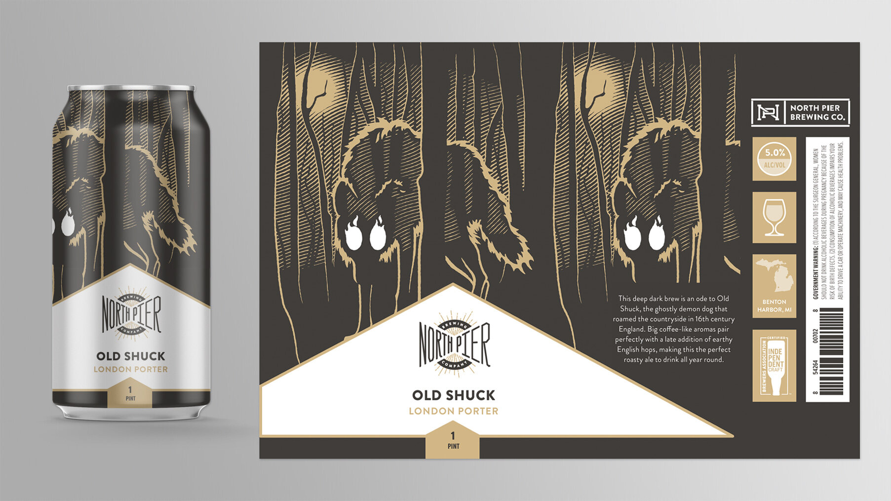
Initially, North Pier’s can labels featured full-bleed wood-cut style illustrations with the brewery name, beer style, and other information on the back. The cans were gorgeous, but as beers were being added to their line-up North Pier realized they were impractical for the in-store environment. Our team was tasked with solving a design problem; shoppers were having a hard time easily identifying the beer brand and style in store.
This was one of several solutions presented, and featured a style-forward label convention using the original illustrations. The branding was upfront with consistent placement, no matter the can size, and the structure allowed for flexibility with colors to help quickly identify different beer styles. The back and sides of the can had space for an additional branding opportunity along with the beer’s story, alcohol content, recommended glassware, brewery location, certifications, legal lines, and UPC.